• Please review our updated Terms and Rules here

MS-DOS / PC-DOS Floppy Labels

sixtimesseven2

New Member
Joined
May 11, 2021
Messages
1
I have written a couple DOS images from winworld to floppies for my 5150 and they work perfectly.
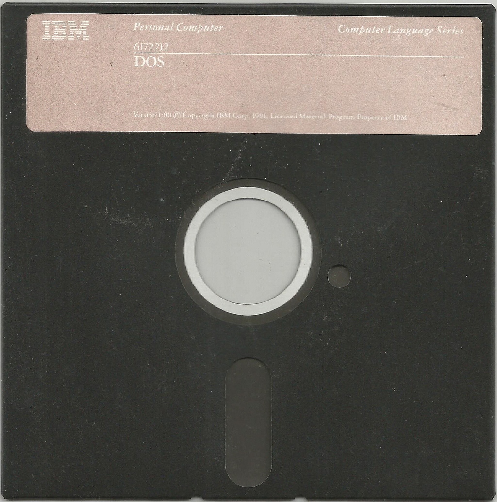
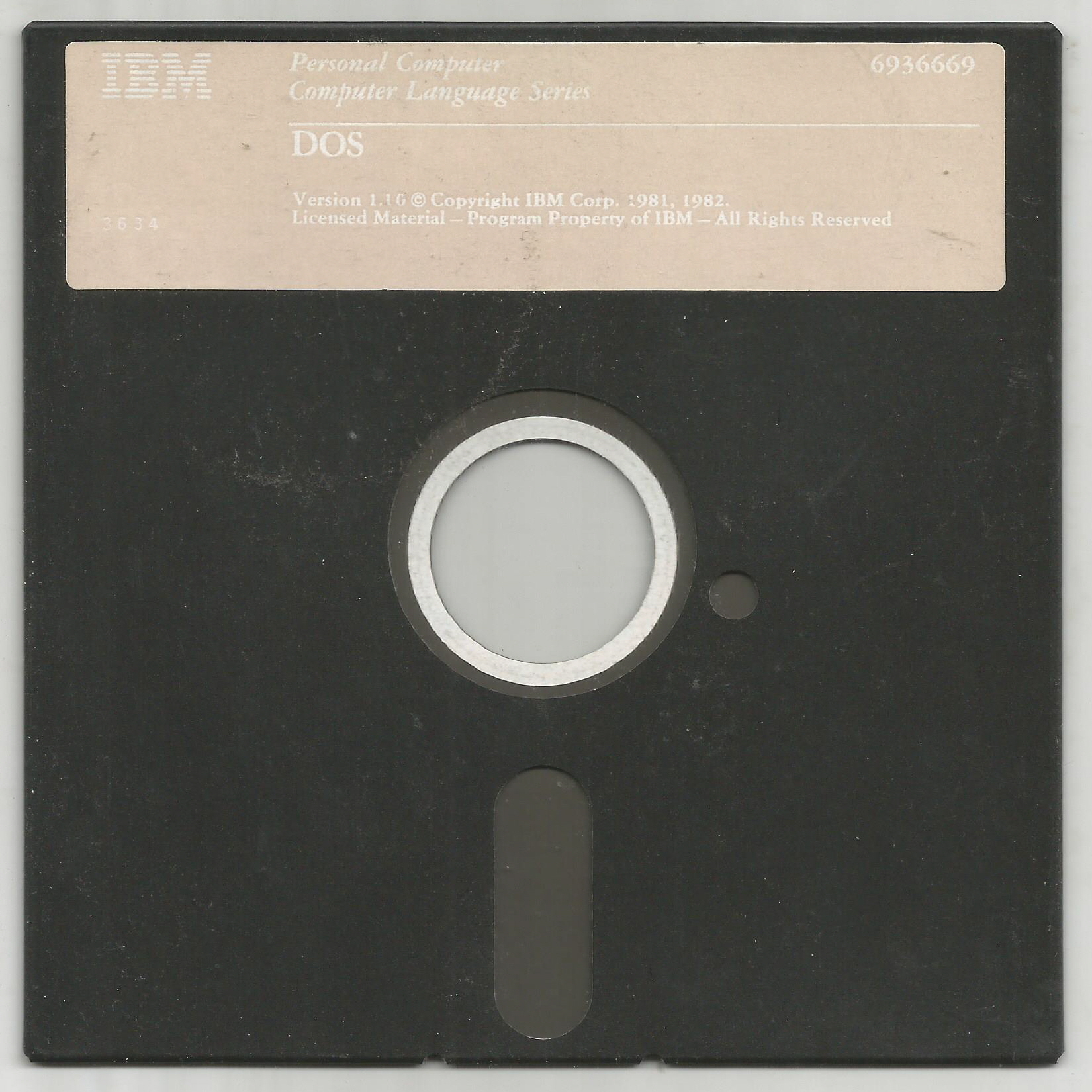
However, I was wondering if there are high resolution photos, or even better, flatbed scans of the floppy labels?
I know there is some artwork attached in the winworld zips, but the labels are blury and the small text is unreadable.

I have black floppies so I tought I could print the original label on sticky paper an have them also optically nice looking and original :)

I would be particularly interested in PC-DOS 1, 1.1, 2 and 2.1. If you post them I could prepare them and upload them as transparent png for reuse.

Thank you!
 
There are some higher res scans of those disks on Google Images and Archive.org, but the faint mauve color IBM used for these releases combined with noise from the grain of the original adhesive label + the glue bleeding through the paper will make it a pain to create transparent PNGs from them that don't look like crap.


Last edited:
Looking at my almost-never-used 1.1 floppy, I was about to comment on the fading with age. Apparently, the inks used by IBM weren't terribly stable, at least for the pinkish color.
 
Unfortunately, a lot of labels suffer from wear and tear, and adhesive leaking through.

Many labels were produced lower resolution than they may look to the unaided eye. Just for example, I scanned a simple black and white Windows 3.1 floppy disk label the other day, visibly the printing looked crisp and clear, but when scanned I could see "jaggy" bits all around the fonts, suggesting it was actually printed using 300DPI or less.

To re-print such a label you would really have to use an image editor to reduce it to an outline of the fonts with solid colors. In some cases, like with these PC-DOS disks, it might just be easier to find a similar font and draw a new label.
 
suggesting it was actually printed using 300DPI or less.
Not sure what resolution you expect, but printing with 300dpi (or rather 360) is pretty much still the norm today. It makes no sense to print with higher resolutions, as the human eye can not see the difference. Stuff like posters or newspapers are even often printed with just 150dpi.

If you scan correctly (twice the resolution of what it was printed with), you don't need any image editing. If something printed with 300dpi is scanned at 600dpi and again printed with 300dpi, you get the same quality as the source you scanned. Of course, if you use professional equipment, that is.
 
For grins and giggles I took a stab at recreating the v1.00 label in Inkscape, and I think it turned out pretty nice. IBM used Garamont Amsterdam heavily for their pre-PS/2 PC branding.
m7lujki.png

(600 dpi)

Feel free to use it, but for the sake of future collectors please keep the reproduction marking on it so they'll know which labels are "fake" and which are real. :)
 
Back
Top